Sponsored Post
It’s quite well known that anyone who’s ever heard of Common Ground will immediately think of a very nice looking co-working space, which it is, but there’s this sort of elusive factor, a je ne sais quoi if you will, that you just can’t pinpoint as to why Common Ground makes for such an attractive place to work in; like you would go and *gasp*, actually want to do some work. After sifting through photos upon photos of various Common Ground locations I think I’ve finally figured out why, and it all boils down to its design. Coming to this conclusion requires me to fully immerse myself in the ethos of the space, and as such, I’ve decided to pay a visit to one of its newer locations, specifically the one at KL33.
The Devil Is In The Details
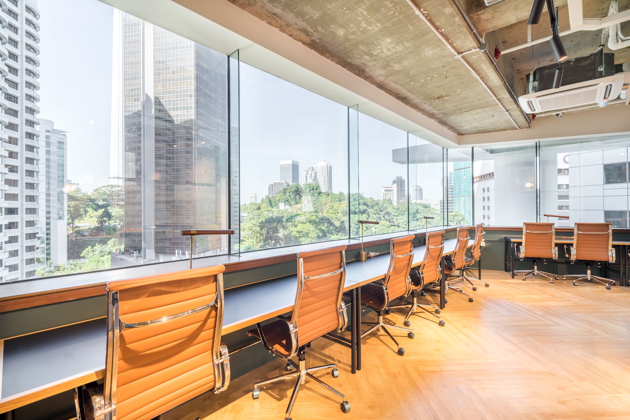
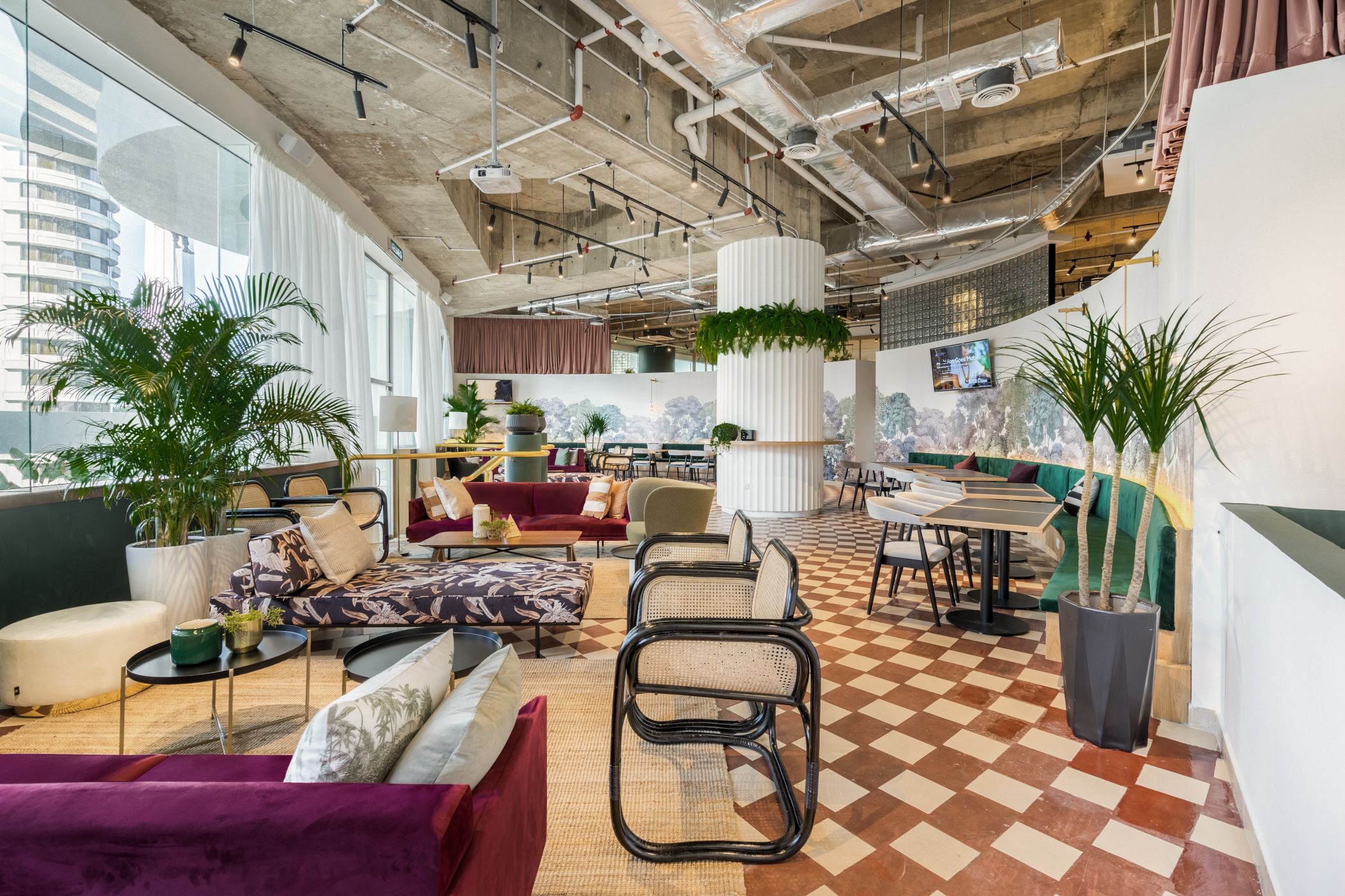
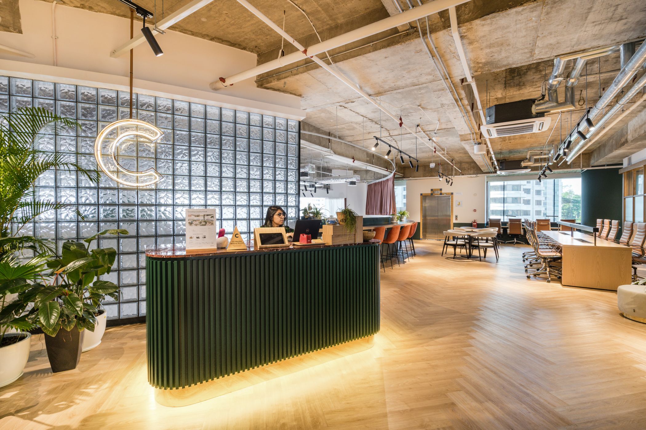
What hits you first when you enter is the abundance of bleached wood paneling, bathed in a pleasant combination of warm lighting and natural sunlight, contrasted with dark green walls. The space is populated with modern furniture, showcasing a swathe of modern contemporary outlooks juxtaposed with an industrialist background. The design language is an eclectic one, combining multiple facets of design to carefully culminate into a singular goal: encouraging productivity.
Picture Credits: Common Ground
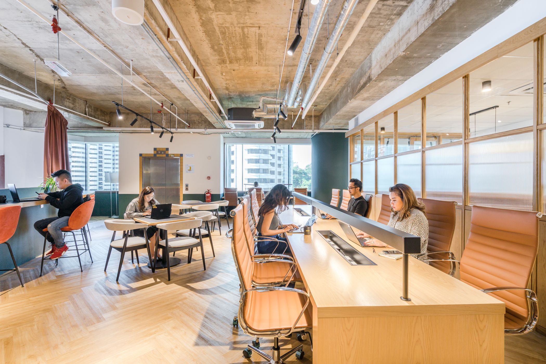
Which brings about a welcomed side-effect to this design language, a feeling of warmth that never escapes as long as you’re in the space. This is also in part to another factor that plays a very important role in the ecosystem of Common Ground, an open workspace with no cubicles in sight. The concept however, is not exactly a new thing, but here it is refined, allowing teams at fixed desks to communicate more effectively and in a much more collaborative manner.
Picture Credits: Common Ground
While it does perpetuate this relaxed feeling, it doesn’t lose sight of what the space has set out to do in the first place. The office chairs are comfortable, inviting your productivity as you take a seat, posture upright, just nice to work in without having to resort to awkward positions to make one’s self feel comfortable. It’s all these little niggles, the tiny details that Common Ground has gotten right that makes me appreciate the thought and effort that has gone through to make this just a little bit more cohesive.
While Common Ground strives to keep some level of uniformity when it comes to the design language throughout all the venues, KL33 sets itself apart from the others with the presence of dark, red flooring complementing the rest of Common Ground’s palette.
 Picture Credits: Common Ground
Colour Me Impressed
The colourful aspect of Common Ground also makes up a big chunk of the proverbial pie when it comes to bolstering productivity. Most individuals’ mood can be altered with a wise choice of colours, that not only changes feelings, but the inner subconscious. According to colour psychology, Green gives a sense of relaxation, calmness and focus that also helps to reduce anxiety, and generally very pleasing to look at. Yellow on the other hand, gives an emotional stint that lifts motivation and self-esteem. It also helps to improve creativity, all the while increasing confidence, fun, happiness, and optimism at the workplace.
Picture Credits: Common Ground
On top of that, amenities in the form of a cafe, office supplies, and lounge area contribute to the overall atmosphere and hospitality aspects of the space, making for a truly one stop shop to ensure productivity never dips. And in the ever increasing competition of today’s working world, every productive second counts into making something great.
