If you’ve been keeping up with the net, you’ll come to notice a few mixed up Nikes appearing on your feed with copious amounts of branding stamped everywhere on the shoe. It’s by no means as overly in your face like the previous “Just Do It” pack, but the fact that there’s more than 3 Swoosh logos means the upper management is realising something it should have realised a long time ago.
Enter our favourite brand to talk, rant, complain, get pissed about, yet still biting the hook: Off-White. Before when Virgil decided to unceremoniously plaster obvious branding in quotation marks at every panel of a shoe, sneakers were mostly defined by colours, which were then defined by the theme that celebrated certain milestones or events that happened parallel to the shoe’s lifetime.


The Air Jordan 11 ‘Concord’ signified MJ’s return to court with only the #45 numbering on the heel to mark his new jersey number to differentiate the model from the others. Shoes like ASICS, often collaborated with retailers for special editions of the Gel-Lyte 3; one prime example being the AFEW X BEAMS X Asics ‘Koi’ Gel-Lyte 3, which represented Germany’s friendship with the Far East, and how the culture has united countries from across the continent to come and collaborate all in the love of sneakers.
Stories were told in the form of colours and materials, with only co-branding existing on the side panels, often for the shoe to make itself known that it was a limited edition. Until Off-White came and stamped whatever it could onto anything.
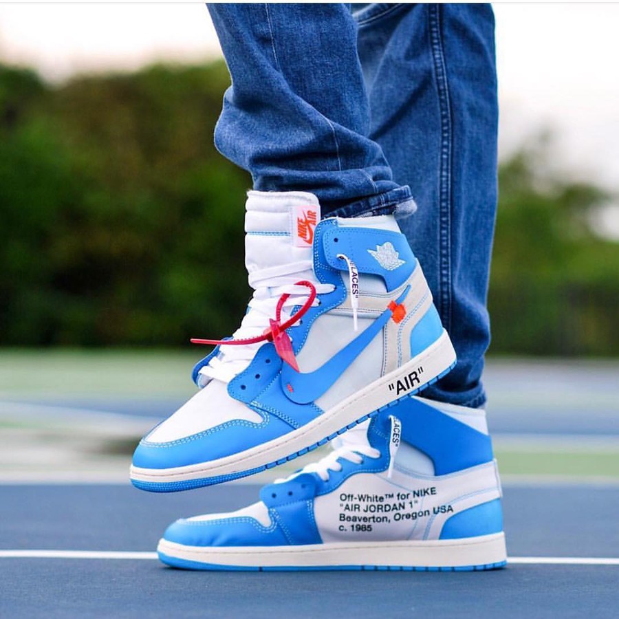
This level of branding meant that people who were’t sneaker people knew what it was; they could spot an Off-White shoe from a mile away from the deconstructed look and the obnoxious “AIR” stamped on the midsole, hence the ensuing hype that defined Gen Z. It also didn’t help that Sean Wotherspoon came up with a bespoke Air Max 1 with triple Swoosh on the tongue for added effect. Nobody cared for the price. All they wanted was to be seen in a shoe that they know not many are able to afford, hence, labeling themselves as the consumers of the upper echelon of the streetwear community.
Hence why, Nike’s ‘Overbranding’ pack won’t really work down on the rungs. People already know that it’s a Nike, and unless it’s a limited collaboration model, no more labelling is needed to distinguish itself from the rest of the product line. Admittedly, the pack consists of models that aren’t really bright or bold, and with the exception of the Air Max 95 in ‘Total Orange,’ the models can easily be passed off as other GR models. That is, until you take a closer look.


The Air Max 97 detracts away from its original design, foregoing the Swoosh for the typed Nike logo, and deploying the mini-Swoosh upfront in an effort to remix the silhouette a bit. Kendrick Lamar influences are present with the tongue ribbon that writes Air Max on the top that ends with a heel tab in the same design. The Vapormax Plus has an abundance of swooshes on the upper, and the Air Max 95 presents more Nike typography on the laces, with a mini-swoosh. You can decide for yourself if it’s a bit much or not.


In any case, I still think that it’s really unnecessary to have so many logos on one shoe. Let the silhouette do the talking instead, and walk knowing that people will gawp regardless if they know what’s on feet.
