Written by Aida Rashid
The Malaysian independent music scene is lacking in one thing: It’s creative aspect from a visual & conceptual perspective. However this is probably down to a multitude of different factors, lack of resources, little to no support from the government, and at the most surface level, lack of appreciation by the people who consume it. Despite this though, we are currently in a rise whereby more artists and bands realise the importance of the concept and visual impact, and are now brave enough to take the risk to be more experimental with their music and the branding attached to it.
And we have a few pioneering acts that trialed their way and succeeded, from the likes of Lunadira capturing massive attentions and hitting a million streams with her elaborate single-track campaigns, “Stuck With You,” and “ur cute but boring,” and Spooky Wet Dreams’ “Koleksi Dendangan Untuk Masa Hadapan” which chronicled the in-between period of pre-elections, while detailing a commentary of day-to-day injustices, but the most recent and intriguing one came from a seemingly underrated cover featuring an old man flanked by a bunch of people taking photos; a conceptual masterpiece executed flawlessly in the form of Tekesima, by LUST.
Having already dissected the musical aspect of their exceptional debut album, the visual concept of their latest release makes up the other half of their exceptionality. Realistic, gloomy and rustic are the words to describe the concept on the surface – looking at the music videos and the album art. The enigmatic portrayal of the old man on their cover art also lures people into a state of curiosity. In contrast, their debut EP ‘chingichanga’ gives off a rather vibrant and provocative vibe, but at the same time accentuates the mystery of the band and record altogether. Musically, ‘Tekesima’ revolves around the social commentary of human behaviours in the era of technology and modernisation – and it is astounding to see how the visuals reflect that narrative perfectly.

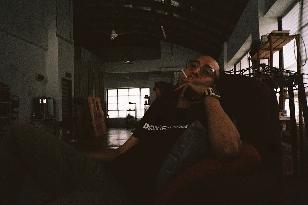
Pictured: Amir Johari, Credits: Sasha Ningkan
Aside from the band members itself, creative director Amir Johari was instrumental to the execution of the creative vision LUST had for Tekesima. First venturing into directing Ramayan’s Sepintas Sastera Hati music video, with his aim of not merely focusing on the video aesthetics but also the branding of the band that’s attached to it. With LUST, he aimed to do the same, and as luck would have it, the band members have the same vision and direction in terms of album concept. “We came up with the ideas together, I gave them some ideas as the foundation of the concept and they added their own on top of it. When we found ourselves not agreeing with each other, we would discuss it, and that’s really just how we went around everything when it comes to this album.” Amir said.
LUST had always intended for the title of the album ‘Tekesima’, a Malay word which means astonished or simply having a jaw-dropping moment, to become the center of the narrative, and given that there is always some kind of mystery attached to the band itself, Amir felt there was a need to maintain that within the process of exploring the fresh ways LUST could be branded. Amir was given the option to choose either to direct U I Adore or Desire, in which he chose the former due to the storytelling elements of the song which gave him room to explore in combining the two key concepts mentioned earlier.
“For Tekesima, we have 3 videos out. Desire was spearheaded by me; we just wanted to have something that was a snapshot of the current social climate in Malaysia – most of social media, everything is shock value – and shock value relates back to ‘Tekesima’. And the other two (Good To Know, U I Adore) were lead on by our director, Amir. Those were born out of his own art direction and interpretation of what the songs are about.” Azfar from LUST said. Having drawn inspiration from Wes Anderson’s quirky Moonrise Kingdom and gory animated video series Happy Tree Friends, U I Adore music video depicts a scenic journey of a man through Malaysian tropical forest while being followed by a bunch of strange-looking Earth creatures. Amir wanted to lure the audience with questions playing on their minds. “That’s how I wanted Tekesima to be introduced, with full of surprises.” With Good To Know, it was rather a simple one that shot in the process of producing the cover art. It was more about introducing the old man as the main subject of the story, his workspace, his architecture models – all in the name of arousing curiosity. “Faris wanted it to look like a photo that later on halfway into the song turned out to be a video, so I decided to just put have the camera there and have a go at it.” Amir said.
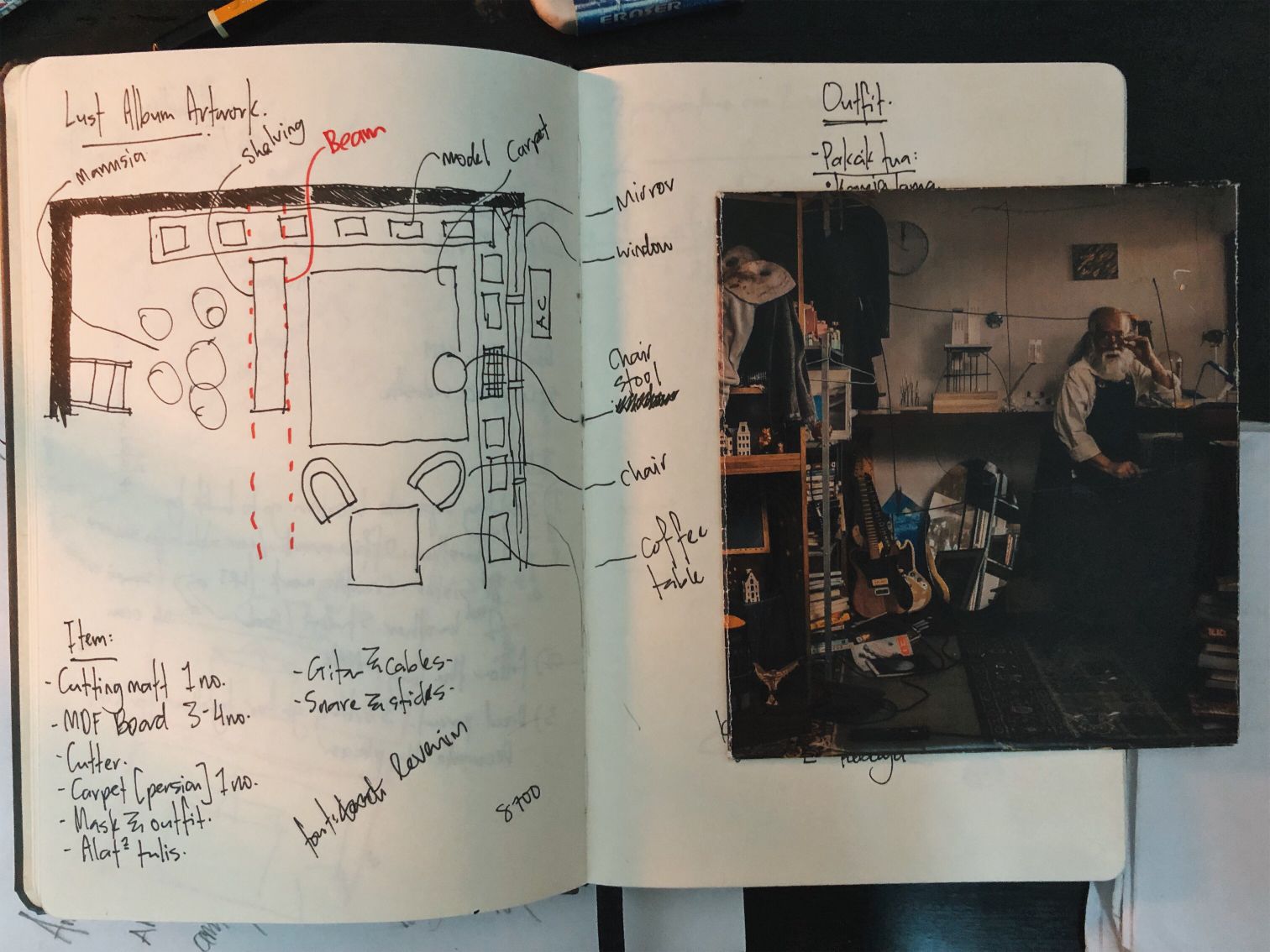
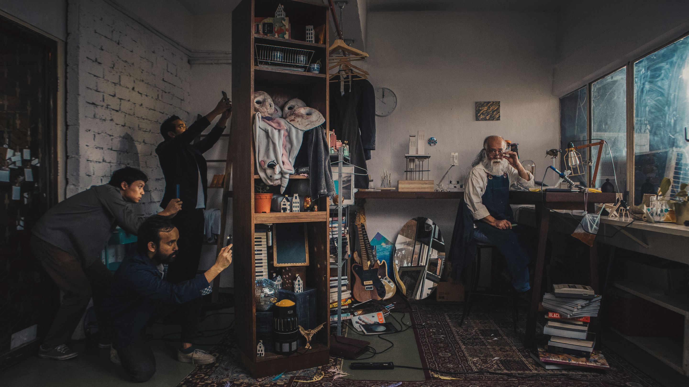
While the music videos play a prominent role in forwarding the concept LUST wanted to portray, they focused on another part often overlooked upon to further tell their story: their cover art. The renaissance painting-like cover art portrays an old man in his small working space with his belongings that very much define his personality to a certain extent — the architecture models, the masks, guitar and etc. It poses questions to the viewer about the story behind this mysterious old person. According to Amir, having drawn inspiration from The Matrix, the cover art is meant to portray an old man who had been invested in making architecture models for the past few decades, in which what is seen by the viewer is the archive of ideas that he has had for all those years. His architecture models could be interpreted as portals to another world, another reality. He is surrounded by books, guitars, and spoiler alert — a cameo of the masks used in ‘U I Adore’. It gives off an unsettling feeling surrounding an unresolved mystery.

On the other side of the cover, appears the band members of LUST taking photos of the old man with their smartphones — coming across as curious and enthusiastic to capture the fleeting moment. And truly this feels like a jab to almost everyone in this tech savvy generation — craving online validation and attention, and would do almost anything for it. It was meant to describe the obsession of people wanting their posts to be ‘viral’. Whenever there is a new cheap gerai, or a cool place to hang out at, the first thing people would do is to post about it in hopes that they can get a smidge of the fleeting clout, either purely for self-fulfillment purposes or really just wanting to allow people to have access to cheaper and cooler things (which is highly questionable).
The old man’s working space acts as something authentic and intriguing, while the 3 guys taking photos reflecting the society we have today that is popularity-driven. “The cover art with the old man – it was our idea, but initially the old man was supposed to be on an abandoned stage, with a light flashing onto him. But then we talked to Amir and he had a different version of it which we kinda liked it as well. So with Amir’s opinion, we have our cover art right now.” LUST said. Amir sees the importance in making the most out of a cover art and allow people to experience the album through the cover art as well, as opposed to limiting the potential it could reach and the message it could convey. This is something a lot of artists and bands often overlook – placing different perspectives that people can access in interpreting the album as a whole.
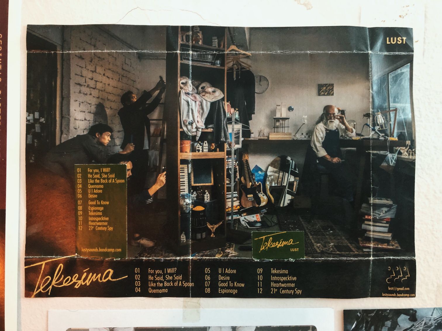
But the craft doesn’t end there. The limited edition of their physical record is truly a manifestation of the denoted surprise. The cover is not your typical hard CD cover, instead it is folded like a present. Through every fold, Amir wanted it’s listener to make sure that the full experience of the album is more meaningful, fun and different from the usual. “It holds the effect of Tekesima in essence, that everything is tied together and you would have to buy the physical copy in order to get the full experience.” Amir said. The details in the cover art are also utilised in the execution of the surprise. For instance, parts of the cover art are used as individual posts on their Instagram — making them seem like puzzle pieces meant to be assembled. However, you would only be able to see the complete picture if you get the physical copy of the album. “We want to let the name of the album to speak for itself, with the assistance of the art surrounding it. We want the experience, and we want to allow people to buy not just the music, but also the experience attached to it.”
What makes the album truly unique however, is the process in making it.

“There’s a lot of give and take in the process, sebab kita tak ada banyak budget, semua DIY, semua pakai duit sendiri,” Amir said when asked about the creative process of the album. Their grit and their passion were the things that moved them as a team in executing the whole thing as planned. Taking only 1 day to shoot ‘U I Adore’ in Cameron Highlands and another shoot the album art together with the ‘Good To Know’ music video, they were met with a long list of challenges which could not have been defeated without the perseverance they had and the exceptional teamwork that came along with it. The process also involved people from different scenes, featuring the likes of Sofia Haron, a Malaysian contemporary artist with the masks used in ‘U I Adore’, Shamin Sahrum & Sarah Rahman with the architecture models used in the cover art, Zainal ‘Lalan’ Abidin, Alif Adzham, who acted as the main guy in ‘U I Adore’. It is interesting what you’re able to garner from such collaborations that are direly missing in our music industry. The merging of such industries enables one to create a more wholesome, unique and colourful perspective to how we view music. Ironically, constraints can actually breed creativity, and working with what they had meant thinking outside of the box which resulted to something that would rival even big production houses.
In this day and age of instant-ness and rapid gratification, will works of art such as this stand the test of time 10 years down the line? Is it worth the effort for bands and artists to explore such a level of detail and pursuit of exceptional story-telling while at the same time knowing the majority of appreciation will only rest on the music? Or would this trend of music being bigger than itself eventually penetrate into the mainstream market and change how we all see music — that it does not just stop at the technicality of music but it expands to a more wholesome perspective of looking at music? I think the independent Malaysian music scene, whilst still being in its experimental stage when it comes to all this, is definitely ready for a new wave of creativity. Creativity paves the way for a stronger identity, and when music goes hand in hand with a fully-fledged persona, you know we’re ready for anything.


