A Chat With Shantell Martin And Her Collab With PUMA

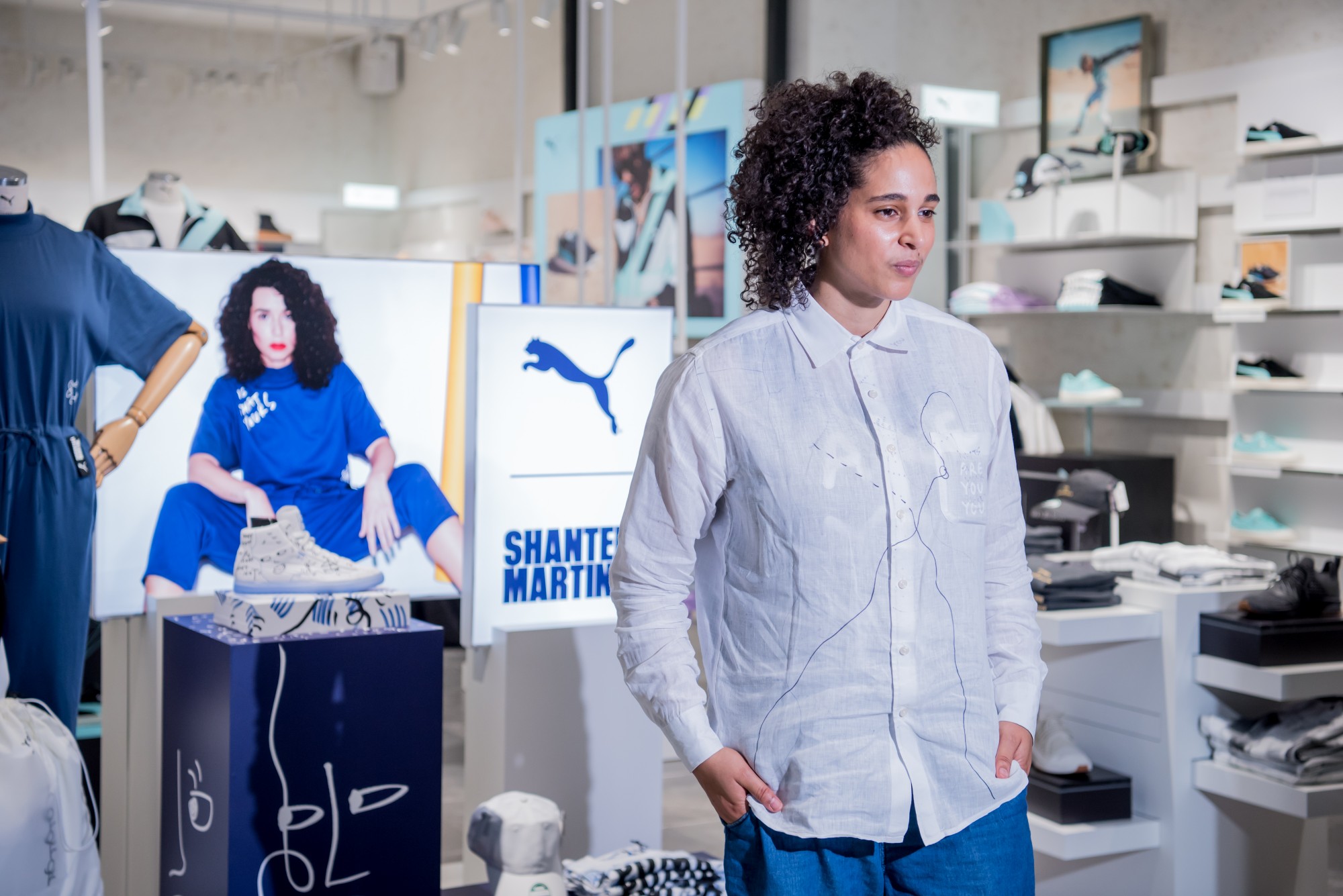
Unique very much describes Shantell Martin’s character. Having only worked almost exclusively with black and white, Shantell talks to us about the concept of her art, her reasoning behind her colour palette, her views on the ever evolving art scene, and her current collaboration with PUMA.

Nabil: Seeing as most of your produced work is comprised of a very monotone palette as well as taking a very minimalistic approach to it what  do you find in pursuing this very specific style and does this translate your vision well?

Shantell Martin: As you mentioned, I do work a lot with black and white. I do this for many reasons. With black and white, it is very calming to me, and also you can’t hide from it, so for example you have to be very good in it for it to work because within black and white you can see mistakes or you can see your confidence, you can see if you hesitate, so I love the idea that with a monochromatic palette, you get to really push your craft and show a sense of mastery then at the same time you create a landscape which is very calming.

N: Do you have any favourite colour besides black and white?

SM:. It changes all the time right now maybe its red or orange I’m not sure.

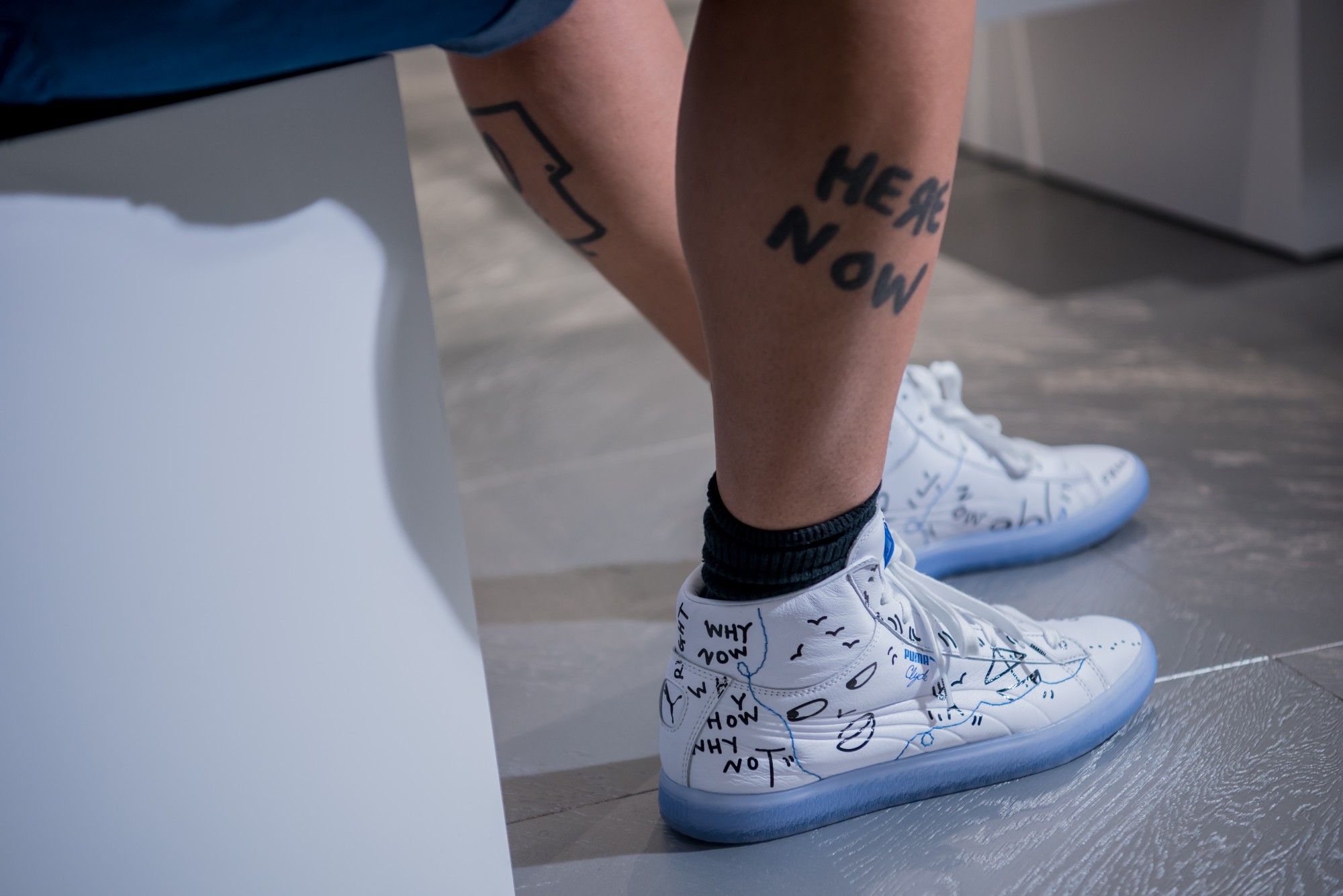
N: Tell us a little bit on how you translate your art into the collection.

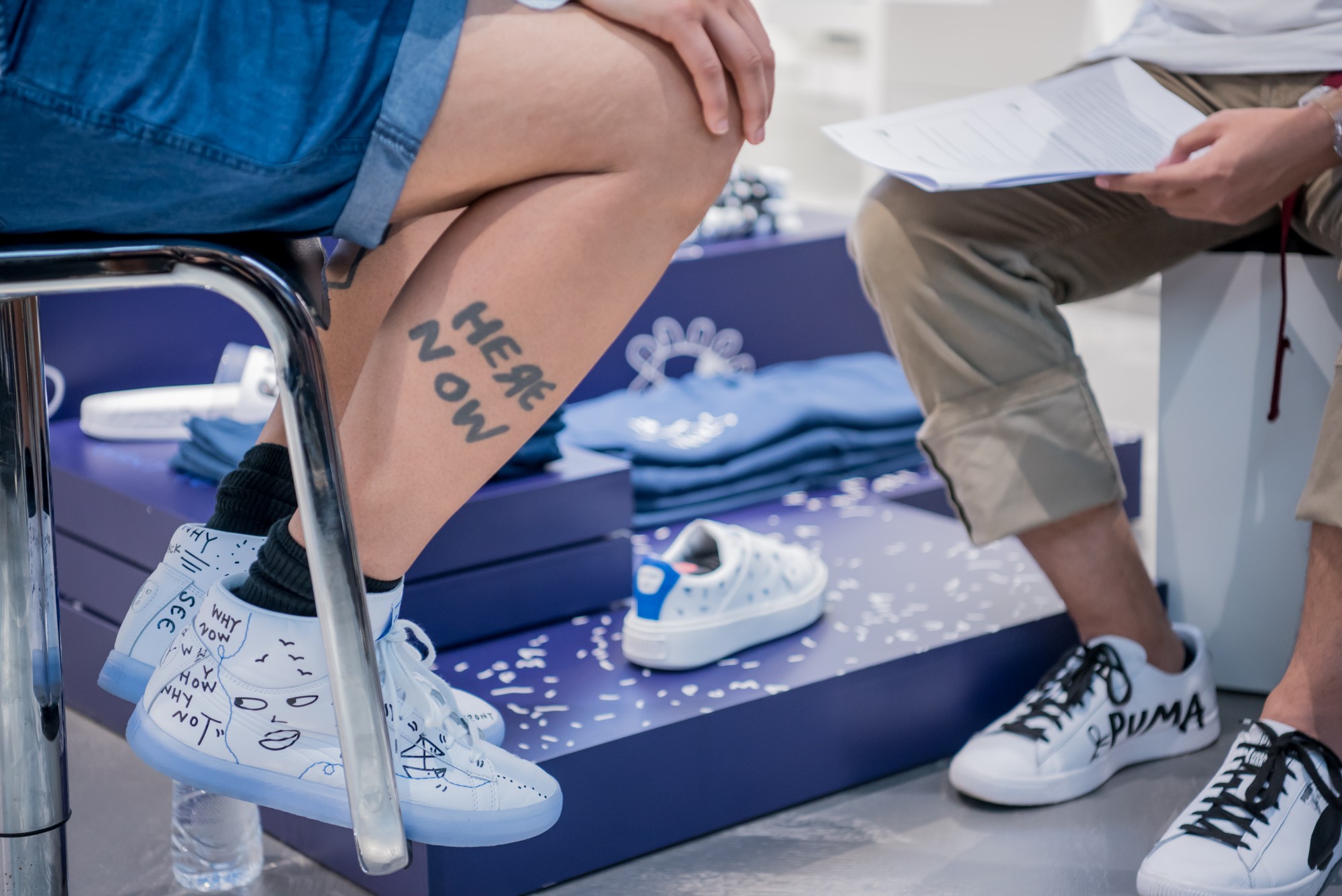
SM: So the collaboration with PUMA is an extensive collab; we have shoes, we have apparel, we have accessories, and what is nice about this is you’re combining fashion, you’re combining something thats wearable with art. So for example you have the classic Clyde now, but theres so many layers and details in there. You have the sole, the tips of the laces, you have the left and right under the sole, you have the inserts. Theres all these nice layers of details, so you get to create a pair of shoes but it’s also an art. So I think it’s something really special when I can take my message as an artist and you wear it around.

N: How do you balance commercialisation and artistic value in your pieces?

SM: So its interesting you know with art, there’s these two sides, you know. There’s apparently a commercial world and there’s a fine art world and so I guess I’m one of a few artists that do a lot in both spaces. You can find my work in museums and galleries, you also find it in PUMA or Tiffany and Co. In these other places for me, it’s more about doing projects that I really enjoy in which lately fit the message. I think I didn’t create the boxes for commercial fine art so I’m only going to do what I enjoy and it doesn’t matter wherever that fits.

N: What matters to you, the final product or the process of creating said product?

SM: So for me the process of my work is a big part of the work you know sometimes people think the process isn’t the work, its about the final product but I’m the other way around so most of my work is actually create with an audience because I think its important that they see that process you know? Sometimes you have the artist hide in their studio and create the work then the work appears in a frame in a gallery. For me there’s a distance between the viewer and the audience and the artist when you do that but when you expose the process and you share the process, you don’t use magic but you open up to people into your world and I think people are more connected and there’s more of an experience when you do that so for me process is more important

N: We heard that you studied liveophography right in Japan, so do you listen to music when you create something of this particular this PUMA collaboration?

SM: So when I’m working I always listen to music and now recently I started to have friends curate a playlist for me so so that can inspire me when I work and so its really important that you listen to music cause if I’m not listening to music I’m drawing to the same music in my head. That’s the same music that’s in my playlist and when you listen to music, when you draw, when you working on a collaboration like this it gives you a different spring board, it gives you a different energy it gives you a different rhythm and that’s important.

N: So talking about the millennials and art especially in Asia now, we are very artsy, very visual oriented when it comes to social media exposure, taking ootd pictures, what do you think about that ? Is this art or is this a trend?

SM: It’s just how we connect. It’s just how we share, how we experience. It’s just the future we are living in, and thats what that is now and its happening everywhere. I think there’s pros and there’s cons you know, the positives to that is when I was younger I didn’t know anyone that did what I did, so I had to grow up and then I realised that there are other artist in the world that draw and then now you know cause you go on social media and you can find other artists. You can find anyone in the world, and I think the pros are that we are more connected. We can be more inspired by people who are outside where you live. The negative things are maybe we become more internal than external, maybe we are not connected as much as we should with people around us and maybe we aren’t paying attention to what’s going on around us and that can be a negative thing.

N: In your opinion, does the art that one produces reflect the state of society in general such as art produced during political trying times could be vastly different from the ones produced during a prosperous period?

SM: So artists have different agendas, different political times or different types of climate within any countries and culture you’re going to see the artists that make the type of work reflects the culture you’re going to see that within their art. You’re going to see that within their work, you’re going to see that within their words. The work that I create is more kinda about a bigger picture in general about identity and find yourself, and about this idea of freedom. It’s very playful in a way. So to answer your question, yes. It just depends which type of artist you are and the type of genre the artist has.

N: Actually how did you manage to land this collaboration with PUMA?

SM: So, I think we just got connected and then we were just talking a long time. Someone, I forgot who, connected us first and then it was back and forth through emails. 2016, he signed off on it and so it was almost two years ago we decided to do this as I found out that sneakers actually take a long time to make!

N: How would you describe your PUMA collaborations in three words?

SM: Fun, open and creative!

N: Is there any advice for youngsters in Asia that are inspired by your work who want to take their art to the next level?

SM: I guess so, not only in Asia but anywhere, my advice is always to not play the if game. So what I mean by that is if I had money, if I had a studio, if I had the materials, if I had a mentor, if I had a gallery, if I had all these things then I could be an artist. I advise you to create your own opportunities by using what you have access now. So wake up, see what you have, see who you have, maybe its only your friends and your family and you start there.

N: Do you have any future releases with Puma?

SM: So this is drop two right here and then there’s another drop I believe next July, drop three its my favourite actually. It’s a lot more colourful and its inspire by me going up in London. So really interesting shapes, bold logos and prints, really colourful. It’s a mixture creating this collection. I wanted to show a little bit of an evolution from a very black and white collection which is drop one and that’s very classic where I’m coming from, that’s the work I create predominantly and then it goes in to a slightly more colourful drop two, where you’re hinting that colour you’re hinting that difference you’re hinting that something more playful and then you drop the third collection, which is going back to my roots and and so that you have that full evolution of where I am now and looking forward in this middle stage and then the final drop which is going back to the beginning that is also the future.

Graph Studio Has Created Possibly The Best Raya PSA Video Yet

We’re only about a quarter way into the Ramadhan month, and Graph Studio has blessed us with a video to kickstart the wave of Raya videos this year. Aptly named BIRU, the video centers around the general masses’ ignorance and relative displacement for the RM1 note, up until Syawal when the denomination is needed to packet for ‘duit raya.’ Have a look at the video above and tell us what you think about it!

Weekly Recap 03

A Royal wedding of taboo breaking proportions, a designer’s debut mark on David Beckham, and the white/gold blue/black dress camaraderie repeats itself in 2018. Here’s what you missed out worldwide last week in this episode of The Weekly Recap!

Prince Harry and Meghan Markle Tie The Knot


The momentous occasion happened last Sunday at St. George’s Chapel whereby a new era in the Monarchy is ushered in that’s all the more inclusive than ever in the history of the Royal Family. For the first time in the history of the world, a person of African-American descent is welcomed into the enclave by way of marriage to Prince Harry, who’s 6th in the line to the throne. While there are many words to say on how the marriage completely dispels tradition, one Denise Crawford, a stenographer from Brooklyn summarised it nicely. “One of the children of slaves is marrying a royal whose forerunners sanctioned slavery; the lion is lying down with the lamb.”

Many A-listers were present during the ceremony, from the likes of the Suits’ cast, of which Markle plays a paralegal, to the Clooney’s, Serena Williams, as well as Britain’s favourite power couple, which brings us to…..

David Beckham debuts Dior Homme suit designed by Kim Jones

Practically Jones’s debut on the world stage, Beckham peeks at the new direction that the fashion house is taking. Much unlike Dior’s recent takes from the likes Kris Van Assche’s design, whom perpetrated a very aggressive styling front, Jones takes a much more elegant and streamlined appeal to Dior’s design DNA, translating it well into what can only be described as a modern classic. If this is any indication, Jones’s debut runway show should unveil the full picture of where he’s helming the fashion house.

Grimes legally changes her name to ‘c’

Of which she was encouraged to do so by tech and rocket entrepreneur, Elon Musk. While she’ll still perform under the Grimes moniker, her real name however will be changed from Claire Boucher to ‘c’ Boucher. Grimes dubs the ‘c’ as a nod to the annotation used for the speed of light, but it’s also because according to her, Claire has been the bane to her existence ever since she became sentient. If you’ve never heard of Grimes, click on the link below to know more about her music.

The internet goes batshit crazy for ‘Yanni’ or ‘Laurel’

Y’all remember once upon a time people went apeshit over the the difference in colour of the dress, whether it was black/blue or white/gold? Yeah, it’s happening again, this time with a text-to-speech translation of laurel, which also sounds like yanni. According to psychologists, the difference is all down to the technical properties of the sound, of which is focused on the higher frequencies, Yanni would be heard. However if the lower frequencies are focused, Laurel is heard instead of Yanni. The sound is an ambiguous one, and is influenced by many factors, most notably in regards to the reproduction of it through the individual’s speakers or headphones and the variations in pickup from the listener’s ears.

Mastermind JAPAN collaborates with Converse On The Jack Purcell Model

Minimalism, refined. Mastermind imbues its iconic crossbone skull graphic to the Jack Purcell Canvas, clad in standard black and cream detailing. Much of the accents are present on the tongue, where the Mastermind logo is printed, and Mastermind wording on the toe cup. This version of the Jack Purcell comes equipped with an extra thick rubber tooling, and shallow metal spikes on the top eyelets for a more accented feel. Unfortunately, the collaboration is exclusively available in-store and online in Japan, so get ready to dry your bank account on the resell market for a pair of these.


How To Legit Check A Nike Air Presto x Off-White

Recently, we shared how to legit check a pair of Air Jordan 1 x Off-White which is arguably one of the most coveted pairs among ‘The Ten’. Another silhouette which is highly sought after is the Nike Air Presto x Off-White where plenty of counterfeits have been flooding the resell market as the Chinese factories try to make a profit by replicating the pair. We love paying authentic resell prices and receive counterfeits, said no one ever.

Today, we will be sharing with you some details to check out before purchasing a pair to ensure the pair’s legitimacy. Let’s begin!

Orange Tab

The orange tab stitched to the Swoosh has sharp edges and not curved. Some fakes may have ‘sharper’ edges but are still slightly rounded. If you are still unsure, search official photos of the pair and compare. Most fakes have the rounded edges which is an easy giveaway but do stay alert as some counterfeit pairs have perfected the orange tab detail.

Swoosh

We know how difficult it is to differentiate the black Swoosh on the Presto’s due to the texture of the material used for the Swoosh but if there’s one thing we realize is that the Swoosh on a retail pair is matte black while most fakes are glossy. The stitching on the Swoosh is denser meaning more stitching and is more consistent when compared to the fakes.

Hangtag

One thing that you can focus on for the hangtag is the font of the wordings. From the image below, you can clearly see the significant difference between the font of the real and fake hangtag. The red color of the hangtag is not bright and has a more matte finish to it. Another way to determine a real and a fake using the hangtag is by examining the circles and the square at the part where the hangtag is inserted to create a loop. The circle should not overlap with the square on the real pair while you can examine the circles overlapping the square on the fakes. The fake hangtags have improved over the days since it has been released so be cautious and examine other details of the pair.

Backtab

This is one of the easiest giveaways of a fake pair. The stitching on the backtab has to be almost right below the black strap and has to be neat as compared to the messy stitching of the fakes. Some backtabs are more translucent or much darker compared to the original pair. Don’t worry, we provided you a photo of the original pair’s stitching and backtab for your reference below.

Laces (extra laces)

One thing you do have to note is that retail pairs come laced up in white laces. Any other pair that comes laced up in green or orange is fake, especially when the white laces come as extra laces and is wrapped up neatly. The extra laces should come in green, orange and black and will be wrapped up as shown in the image below. The second photo under this ‘Laces’ segment is usually how the fakes come, wrapped up neatly. If the Presto comes with extra laces in small plastic bags, the pair is a definitely fake so don’t waste any more time checking. The font and color of the “SHOELACES” on the shoelaces should be consistent and bold compared to the fakes which are usually faded, crooked or thin.


There you go, sneakerheads! These are the main details that you should look out for before purchasing any pair as fakes are floating around and we definitely do not want you to be a victim of a counterfeit pair. The last pointer for all is that these Nike Air Presto x Off-White DO NOT COME IN HALF SIZES. If the sizing has a “.5” in it, its definitely a fake as all retail pairs only come in full sizes (8, 9, 10, etc). Good luck!


Get It Kicking With LV’s New Collab With FIFA

For those of you are going to Russia to catch the FIFA World Cup 2018, why not do it ‘Jetsetter’ style with Louis Vuitton? Back during the 2010 FIFA World Cup, the duo had previously collaborated to create a travel case. But for this year, LV has decided to take it up a notch by introducing an entire collection of leather goods, featuring variations of the classic Keepall & Apollo bags as well as a series of small leather goods like card holders & wallets.

The leather goods are inspired by the 1970 official FIFA World Cup match ball, reminiscent of a classic football featuring a hexagon shaped design on the leather goods with each colour of the hexagon having a unique textured feel. All of that combined with Louis Vuitton’s iconic ‘Epi Leather’ which makes it stylish yet durable for day to day use.

For those of you who want an extra edge to this collection, Louis Vuitton has a special ‘Made to Order’ that will accommodate the hexagon to any colours associated with almost any national flag. To top it off, a complimentary leather luggage tag will be embossed with any of the 35 participating national flags.

The collection is now available at selected Louis Vuitton stores & online till July 15.

Tarik Jeans Introduces A New Subbrand Called Celaka Tees

We all know what ‘Celaka’ means. An old school, brash curse word usually associated with negative expressions of frustrations, meant in distaste and in disdain. Only in the style of the roughness that Tarik Jeans is known for, Celaka Tees was introduced to the scene by way of a rock show, hosted at InTun Nation, TTDI. Aptly named ‘Malam Celaka,’ the concert represents the first of many instalments in a series that places focus on amazing local music and fashion.

Three acts were called upon for the show, from the likes of Berdosa, Glass, and Balan Kashmir to ramp up the event with experimental, post-rock and hip hop music. ‘Malam Celaka’ proves to be more than just an eargasmic experience, but also an assault on the visual senses. The night also marks a collaboration appreciation with Tarik’s partners at Saint Barkley, Marijoinlah, Kronoz Denim, Tiga Supply, The Gasket Alley, and Blue Mountain & Co.

Celaka Tees represents itself as a separate entity from Tarik Jeans, free to carry itself in its own unique direction when it comes to vibe and style.  The sub-brand focuses on bringing self-expression onto another level with its upfront graphic tees that pokes fun at popular culture. Each item is priced at RM69.

PUMA And Cara Delevingne Release The Muse Cut-Out

PUMA’s taken very unique routes for its Summer 18′ collection, and the new introduction to the Muse family is no different. Dubbed the Muse Cut-Out, the new entry represents a part of the AW18 Women’s range, echoing the “Do You” message, in an effort to inspire women empowerment and confidence.

Hence why, the brand has employed activist, and ambassador Cara Delevingne to relay the thematics of the shoe; with both embodying a bold style and boundary pushing ability. The Muse Cut-Out differs very much from the others in the same line; angular cutlines are present, as well as more apparent technical detailing, and features a split outsole, inspired by the art of dance. The shoe is finished in bright neon colours that exemplifies the boldness, and agility of the silhouette. Other features include a buckle and exposed cuts in the lateral side, contrasting a very industrial look with minute fashion details.

The all-new Muse Cut-Out drops on May 19 in PUMA KLCC, PUMA Pavilion, PUMA Sunway, PUMA The Gardens, and PUMA IOI at RM 459.

The Borak Borak Session : Fikri Fadzil a.k.a. Bayangan

The founder of The Wknd Sessions, Fikri Fadzil takes us on a journey detailing on his solo project, Bayangan. From why he started his musical journey, to his inspirations, and his opinions on the tenacity of passion, listen to his views right here, in this edition of Borak Borak.

Stussy’s Summer/Spring 18′ Collection Is Here

Written by Celine Kitt

The streetwear OG, Stussy, is back with their Spring/Summer 18’ collection. Deriving inspiration from the important times in American history, the collection designs are heavily reminiscent of 60’s psychedelia and re-worked military garbs at that time. It showcases an old yet modern take on the collection with new dye-ing techniques, complex patterning, intricate stitching and bold print jobs. Breaking away from tradition with flare but still keeps itself rooted. 

The collection is available now online and in Stussy Kuala Lumpur. Head down to the store to cop these beauties before they sell out!

From 1985 To 2018, Jordan Brand’s Upcoming Release Honors Michael Jordan’s All-Star Weekend Sneakers

The Air Jordan 1 Retro High OG “Homage To Home” exclusively released in Chicago with a production number of only 2,300 pairs made available. The un-numbered version of the exact sneaker will be releasing this week, 19th May on Nike, in larger quantity.

The origin of how this colorway came about is inspired by the sneakers Michael Jordan (MJ) took flight in the Dunk Contest on the Saturday of All-Star Weekend as well as the All-Star game where he was a starter.

MJ broke out one of the most iconic sneakers in the industry on Saturday, the Air Jordan 1 “Banned” to an impressive second place finish, recording the only perfect score of the night. During the All-Star Game on Sunday, Jordan laced up in a pair of AJ1 “Chicago” with an aura of swagger that only NBA veterans had in the past. Ever since that weekend, both the “Chicago” and “Bred” colorway of the Air Jordan 1 rose to the top, ending up being the cream of the crop. Jordan Brand finally found a way to honor both colorways simultaneously with one distinguished release. All the way from 1985 up to 2018, Jordan Brand honors the only time Michael wore both the “Bred” and “Chicago” colorway in the same weekend, creating the AJ1 “Homage to Home”.

The Air Jordan 1 “Homage To Home” will be releasing this Saturday, with a retail price of RM629. Would you cop?