A Look into the Creative Concept of LUST’s Tekesima

Written by Aida Rashid

The Malaysian independent music scene is lacking in one thing: It’s creative aspect from a visual & conceptual perspective. However this is probably down to a multitude of different factors, lack of resources, little to no support from the government, and at the most surface level, lack of appreciation by the people who consume it. Despite this though, we are currently in a rise whereby more artists and bands realise the importance of the concept and visual impact, and are now brave enough to take the risk to be more experimental with their music and the branding attached to it.

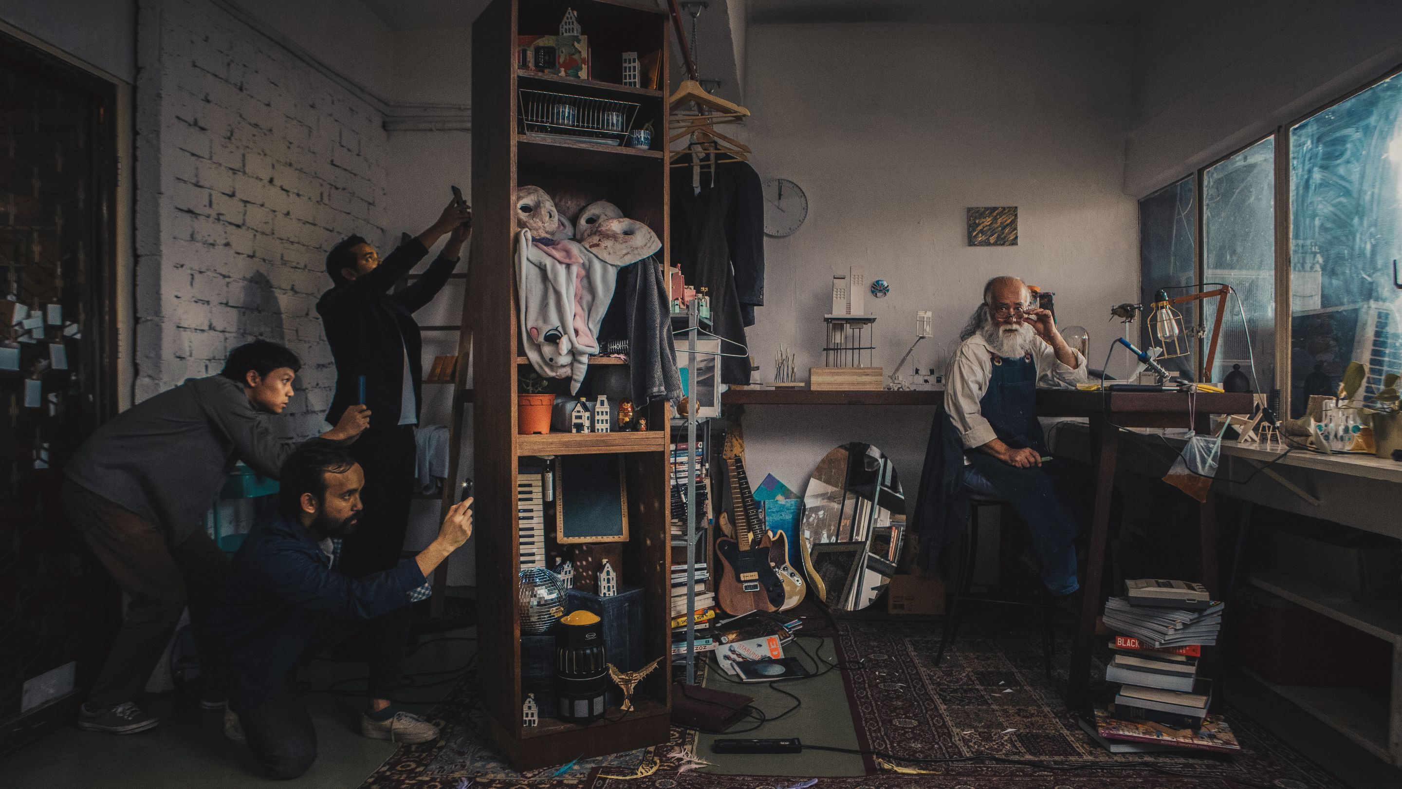
And we have a few pioneering acts that trialed their way and succeeded, from the likes of Lunadira capturing massive attentions and hitting a million streams with her elaborate single-track campaigns, “Stuck With You,” and “ur cute but boring,” and Spooky Wet Dreams’ “Koleksi Dendangan Untuk Masa Hadapan” which chronicled the in-between period of pre-elections, while detailing a commentary of day-to-day injustices, but the most recent and intriguing one came from a seemingly underrated cover featuring an old man flanked by a bunch of people taking photos; a conceptual masterpiece executed flawlessly in the form of Tekesima, by LUST.

Having already dissected the musical aspect of their exceptional debut album, the visual concept of their latest release makes up the other half of their exceptionality. Realistic, gloomy and rustic are the words to describe the concept on the surface – looking at the music videos and the album art. The enigmatic portrayal of the old man on their cover art also lures people into a state of curiosity. In contrast, their debut EP ‘chingichanga’ gives off a rather vibrant and provocative vibe, but at the same time accentuates the mystery of the band and record altogether. Musically, ‘Tekesima’ revolves around the social commentary of human behaviours in the era of technology and modernisation – and it is astounding to see how the visuals reflect that narrative perfectly. 

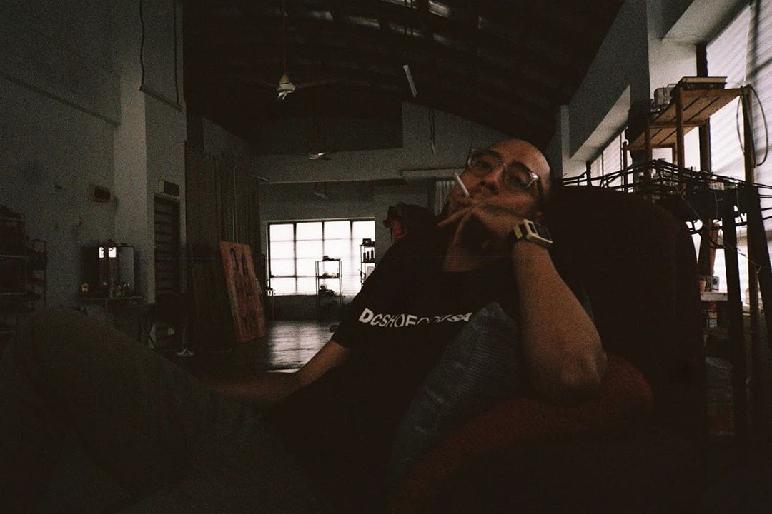
Pictured: Amir Johari, Credits: Sasha Ningkan

Aside from the band members itself, creative director Amir Johari was instrumental to the execution of the creative vision LUST had for Tekesima. First venturing into directing Ramayan’s Sepintas Sastera Hati music video, with his aim of not merely focusing on the video aesthetics but also the branding of the band that’s attached to it. With LUST, he aimed to do the same, and as luck would have it, the band members have the same vision and direction in terms of album concept. “We came up with the ideas together, I gave them some ideas as the foundation of the concept and they added their own on top of it. When we found ourselves not agreeing with each other, we would discuss it, and that’s really just how we went around everything when it comes to this album.” Amir said.

LUST had always intended for the title of the album ‘Tekesima’, a Malay word which means astonished or simply having a jaw-dropping moment, to become the center of the narrative, and given that there is always some kind of mystery attached to the band itself, Amir felt there was a need to maintain that within the process of exploring the fresh ways LUST could be branded. Amir was given the option to choose either to direct U I Adore or Desire, in which he chose the former due to the storytelling elements of the song which gave him room to explore in combining the two key concepts mentioned earlier.

“For Tekesima, we have 3 videos out. Desire was spearheaded by me; we just wanted to have something that was a snapshot of the current social climate in Malaysia – most of social media, everything is shock value – and shock value relates back to ‘Tekesima’. And the other two (Good To Know, U I Adore) were lead on by our director, Amir. Those were born out of his own art direction and interpretation of what the songs are about.” Azfar from LUST said. Having drawn inspiration from Wes Anderson’s quirky Moonrise Kingdom and gory animated video series Happy Tree Friends, U I Adore music video depicts a scenic journey of a man through Malaysian tropical forest while being followed by a bunch of strange-looking Earth creatures. Amir wanted to lure the audience with questions playing on their minds. “That’s how I wanted Tekesima to be introduced, with full of surprises.” With Good To Know, it was rather a simple one that shot in the process of producing the cover art. It was more about introducing the old man as the main subject of the story, his workspace, his architecture models – all in the name of arousing curiosity. “Faris wanted it to look like a photo that later on halfway into the song turned out to be a video, so I decided to just put have the camera there and have a go at it.” Amir said.

While the music videos play a prominent role in forwarding the concept LUST wanted to portray, they focused on another part often overlooked upon to further tell their story: their cover art. The renaissance painting-like cover art portrays an old man in his small working space with his belongings that very much define his personality to a certain extent — the architecture models, the masks, guitar and etc. It poses questions to the viewer about the story behind this mysterious old person. According to Amir, having drawn inspiration from The Matrix, the cover art is meant to portray an old man who had been invested in making architecture models for the past few decades, in which what is seen by the viewer is the archive of ideas that he has had for all those years. His architecture models could be interpreted as portals to another world, another reality. He is surrounded by books, guitars, and spoiler alert — a cameo of the masks used in ‘U I Adore’. It gives off an unsettling feeling surrounding an unresolved mystery.

On the other side of the cover, appears the band members of LUST taking photos of the old man with their smartphones — coming across as curious and enthusiastic to capture the fleeting moment. And truly this feels like a jab to almost everyone in this tech savvy generation — craving online validation and attention, and would do almost anything for it. It was meant to describe the obsession of people wanting their posts to be ‘viral’. Whenever there is a new cheap gerai, or a cool place to hang out at, the first thing people would do is to post about it in hopes that they can get a smidge of the fleeting clout, either purely for self-fulfillment purposes or really just wanting to allow people to have access to cheaper and cooler things (which is highly questionable).

The old man’s working space acts as something authentic and intriguing, while the 3 guys taking photos reflecting the society we have today that is popularity-driven. “The cover art with the old man – it was our idea, but initially the old man was supposed to be on an abandoned stage, with a light flashing onto him. But then we talked to Amir and he had a different version of it which we kinda liked it as well. So with Amir’s opinion, we have our cover art right now.” LUST said. Amir sees the importance in making the most out of a cover art and allow people to experience the album through the cover art as well, as opposed to limiting the potential it could reach and the message it could convey. This is something a lot of artists and bands often overlook – placing different perspectives that people can access in interpreting the album as a whole.

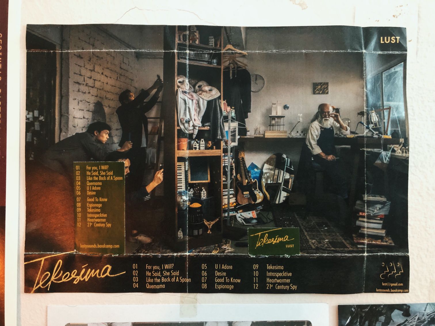
But the craft doesn’t end there. The limited edition of their physical record is truly a manifestation of the denoted surprise. The cover is not your typical hard CD cover, instead it is folded like a present. Through every fold, Amir wanted it’s listener to make sure that the full experience of the album is more meaningful, fun and different from the usual. “It holds the effect of Tekesima in essence, that everything is tied together and you would have to buy the physical copy in order to get the full experience.” Amir said. The details in the cover art are also utilised in the execution of the surprise. For instance, parts of the cover art are used as individual posts on their Instagram — making them seem like puzzle pieces meant to be assembled. However, you would only be able to see the complete picture  if you get the physical copy of the album. “We want to let the name of the album to speak for itself, with the assistance of the art surrounding it. We want the experience, and we want to allow people to buy not just the music, but also the experience attached to it.”

What makes the album truly unique however, is the process in making it.

“There’s a lot of give and take in the process, sebab kita tak ada banyak budget, semua DIY, semua pakai duit sendiri,” Amir said when asked about the creative process of the album. Their grit and their passion were the things that moved them as a team in executing the whole thing as planned. Taking only 1 day to shoot ‘U I Adore’ in Cameron Highlands and another shoot the album art together with the ‘Good To Know’ music video, they were met with a long list of challenges which could not have been defeated without the perseverance they had and the exceptional teamwork that came along with it. The process also involved people from different scenes, featuring the likes of Sofia Haron, a Malaysian contemporary artist with the masks used in ‘U I Adore’,  Shamin Sahrum & Sarah Rahman with the architecture models used in the cover art, Zainal ‘Lalan’ Abidin, Alif Adzham, who acted as the main guy in ‘U I Adore’. It is interesting what you’re able to garner from such collaborations that are direly missing in our music industry. The merging of such industries enables one to create a more wholesome, unique and colourful perspective to how we view music. Ironically, constraints can actually breed creativity, and working with what they had meant thinking outside of the box which resulted to something that would rival even big production houses.

In this day and age of instant-ness and rapid gratification, will works of art such as this stand the test of time 10 years down the line? Is it worth the effort for bands and artists to explore such a level of detail and pursuit of exceptional story-telling while at the same time knowing the majority of appreciation will only rest on the music? Or would this trend of music being bigger than itself eventually penetrate into the mainstream market and change how we all see music — that it does not just stop at the technicality of music but it expands to a more wholesome perspective of looking at music? I think the independent Malaysian music scene, whilst still being in its experimental stage when it comes to all this, is definitely ready for a new wave of creativity. Creativity paves the way for a stronger identity, and when music goes hand in hand with a fully-fledged persona, you know we’re ready for anything.

REJOICE! The Cactus Plant Flea Market X Nike Vapormax 2 Is Dropping Next Week

UPDATE: The Cactus Plant Flea Market X Nike Vapormax 2 is delayed to 24th of May, 2019.

2019’s Most Hype Collab Yet Is Coming To Our Shores

I’m sure many of you have heard of Cactus Plant Flea Market, who have practically rose to fame as the likes of N.E.R.D, Kid Cudi, and Kanye have all collaborated with them to produce Coachella specific merch and several other collections, effectively putting it at the front of the 2019 hype train.

But the hottest collaboration yet comes in the form of a very unlikely silhouette, more specifically, the Vapormax 2, and CPFM’s take on it proves to be the brand’s most unique piece to date.

First impressions look to be a bit of a DIY, handmade project, and you’d be right, as the whole expression of the shoe bases itself on indescribable human quality, which is extremely contrasting from the very technical and technologically advanced Vapormax 2. Let’s start with the most obvious one of all, the bright green garden wiring in the form of a swoosh. Oddly enough, this extra detail does not mirror, rather the swoosh runs parallel, meaning that it is present on the medial side and lateral side of both pairs.

Flanking the sides are 3D printed lettering, spelling out ‘JUST DO IT,’ while CPFM’s signature double eyed smiley face presents itself on the heel counter in yellow, overlaying a dark green upper. The bubbles get a gradient red to translucent black, and green trail laces finish up the silhouette.

While no prices are revealed yet, it is estimated that the shoe will come in at a price of approximately RM 1040. Watch out for the drop date on 14th May, 2019 at Nike.com.


Bryan Thinks The FOG Raid Is Better Than The FOG 1 I WDHANFTSY

A little bit later after the release of the FOG 1, Jerry Lorenzo decides to introduce a more wearable version in the form of the FOG Raid, his rendition of the old Nike Air Raid. Jerry was enamoured by the silhouette when he saw it in high school, and has now brought on the model under the scalpel for his latest collection.

Watch the episode above as Bryan ‘Botak’ Chin and Julian ‘Sunflower’ Leong tackle the model’s differences with the FOG 1, and their varying opinions on the silhouette.

To see the review of the Nike FOG 1, click the link here.

You Can Now Purchase OBSCR x The Gasket Alley’s ‘Ovation’ Collection Online

A few weeks ago, OBSCR & The Gasket Alley teamed up to release a capsule collection that speaks the narrative on the spirit of motion and visibility. The pattern of the racing flag which is usually used in the motorsports industry to communicate important messages to racers was used as an inspiration for the collection to symbolize the communication between creativity and the universe. The collection includes two t-shirts, a long sleeve t-shirt, coach jacket, windbreaker jacket and a Japanese messenger bag.
If you are keen to purchase a piece of the collection, head over to OBSCR’s pop-up store today which is located in The Gasket Alley, Foundry. However, if you’re not around town, fret not because the collection is currently available for purchase on OBSCR’s online store. Which is your favourite piece from the collection?

Off-White Launches The “City Garments” Collection This Week


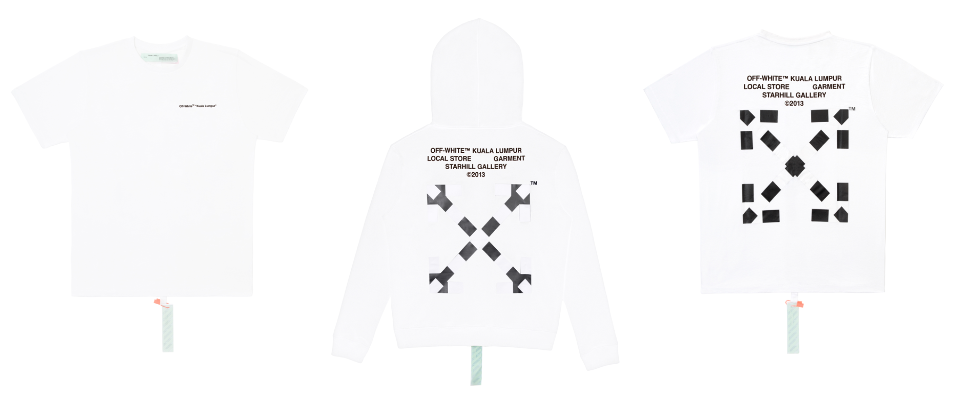
If you’re still into the Off-White hype, now’s a good time to get something that’s a total flex while repping your city at the same time. The brand is releasing its “City Garments” Collection as a tribute to its flagship stores.

The capsule is a small one, only comprising of just a t-shirt and hoodie in both black or white. The city name is printed on the upper right corner on the front and address on the back, flanked by Off-White’s classic diagonal stripe logo.

The collection will be released on May 10th, at 10AM at the Starhill Gallery boutique. T-shirt is priced at RM 1060 whilst the hoodies retail at RM 2050 and will be sold on a first come, first served basis.

ASICS Just Launched A Rework Of The GEL-BONDI Called The GEL-BND

Straight from the launch of the Vivienne Westwood collection, ASICS introduces another silhouette that encapsulates in a more affordable price range, namely the GEL-BND. Taking the essence of Bondi Beach, the shoe combines lush amounts of comfort with a chunky silhouette that draws attention to the shoe.

What is the GEL-BND now used to be a predecessor, namely the GEL-BONDI, which was released back in Spring of 1998 in Australia as a light and breathable triathlon shoe. What set ASICS apart from the others was its liberal use of bright colours, and the re-work pays homage to the spirit by encasing the essence of Bondi Beach unto the colours of the shoe.

Technicals include a breathable open mesh upper, accompanied with a mix of bold and bright colours. A homage to the original GEL-BONDI is also included in the detailings found on the back counter of the shoe. The pack also consists of other colours that are more understated should you wish to remain under the radar.

The ASICS GEL-BND retails for RM 299 and is available now exclusively at Hundred%, Lot 10.

Ryan Matjeraie Talks About Life As A Content Creator After Radio I Cool Story Bro EP 6


Plenty of Cool Stories this week, as Ryan comes on the show to spill the beans about life after radio as a content creator, the difficulties and insecurities that come with making funny videos, before Bryan Chin jumps into the podcast and discuss the future of digital marketing, fake flexing, and brushing up Ryan’s knowledge on streetwear know how.

0:45 – Ryan’s thoughts on Sheldon Nugger on the recent podcast on From the Threads
3:08 – Ryan’s trip to LA and filming reactions of Americans towards Bata, Power, Asadi clogs, counterfeit Gucci’s, LED sneakers
5:02 – Ryan’s thoughts on Malaysians who thinks that the sneaker reaction video was offensive as it’s bashing the Malaysia’s culture
7:32 – Ryan’s role at Rocketfuel
10:15 – Ryan’s thoughts on creating content online vs creating content on radio/tv
12: 27 – Ryan’s radio career at HITZ and how he is able to bring what he learn from radio onto what he is doing today
15:17 – Ryan’s thought on stand up comedy
16:33 – Bryan Botak Chin joins the podcast
17:49 – Ryan’s and Bryan’s first impression of each other
18:42 – Ryan talks about Hitz announcers having fake callers and Bryan being one of them
20:42 – Ryan’s nationality
22:44 – Ryan’s thoughts on his content compared to other content giants like Epicism, Jinnyboy TV etc
24:59 – Ryan on his process of creating content
30:35 – Ryan on being insecure when he puts up a content he isn’t happy with
32:03  – Ryan’s thought on where digital content is heading in the next 5 years
37:52 – Ryan’s thought on creating 60 second video content on Instagram
39:39 – Ryan’s thought on FLEX
45:08 – Ryan’s future plans
45:41 – Ryan’s shark tank pitch for Sneakerlah
49:45 – Ryan on getting into acting
51:20 – Ryan on writing for Harry Kok Siew Yoke
58:39 – Ryan’s sign off

Nike And CLOT Go Retro In Their Latest Collab Featuring The Zoom Haven 97

It has been somewhat trendy for collaborators to bring back obscure models from Nike’s archive, case in point being the Nike X Sacai LDV Waffle Racer, two models that sunk down to the bottom pages of the books, only to be fished out and cast into the spotlight once more. And CLOT is doing the exact same thing with its newest collab: Taking a Zoom Haven upper, and marrying it to an Air Max 97 sole.

Fresh off the ‘Terracotta’ and ‘Infra-Bred’ 13s, this latest one seems to be one of their safer collabs. Originally released in 1999, the Zoom Haven upper features a structured upper designed for cross training. The midfoot cage then, helps lock it down for a more secure feel. The upper is then combined with a full-length Air Max sole, that includes a gum outsole for extra pop.

Three colourways can be had: a clean, all-white version, a sporty, volt and grey infused model, and a classic tricolour layout, featuring stripes of red and blue on an all white background. Eagle eyed spotters will notice CLOT’s emblem on the lateral side of the shoe, sneakily donned up in the same colour as the skeleton of the Air unit.

The CLOT X Nike Air Max Haven drops this Wednesday on the 8th of May for a price of RM 815 at Nike.com.

Common Ground’s Spaces Do Not Feel Like An Office At All, And There Is Good Reason For That

Sponsored Post

It’s quite well known that anyone who’s ever heard of Common Ground will immediately think of a very nice looking co-working space, which it is, but there’s this sort of elusive factor, a je ne sais quoi if you will, that you just can’t pinpoint as to why Common Ground makes for such an attractive place to work in; like you would go and *gasp*, actually want to do some work. After sifting through photos upon photos of various Common Ground locations I think I’ve finally figured out why, and it all boils down to its design. Coming to this conclusion requires me to fully immerse myself in the ethos of the space, and as such, I’ve decided to pay a visit to one of its newer locations, specifically the one at KL33.

The Devil Is In The Details

What hits you first when you enter is the abundance of bleached wood paneling, bathed in a pleasant combination of warm lighting and natural sunlight, contrasted with dark green walls. The space is populated with modern furniture, showcasing a swathe of modern contemporary outlooks juxtaposed with an industrialist background. The design language is an eclectic one, combining multiple facets of design to carefully culminate into a singular goal: encouraging productivity.

Picture Credits: Common Ground

Which brings about a welcomed side-effect to this design language, a feeling of warmth that never escapes as long as you’re in the space. This is also in part to another factor that plays a very important role in the ecosystem of Common Ground, an open workspace with no cubicles in sight. The concept however, is not exactly a new thing, but here it is refined, allowing teams at fixed desks to communicate more effectively and in a much more collaborative manner.

Picture Credits: Common Ground

While it does perpetuate this relaxed feeling, it doesn’t lose sight of what the space has set out to do in the first place. The office chairs are comfortable, inviting your productivity as you take a seat, posture upright, just nice to work in without having to resort to awkward positions to make one’s self feel comfortable. It’s all these little niggles, the tiny details that Common Ground has gotten right that makes me appreciate the thought and effort that has gone through to make this just a little bit more cohesive.

While Common Ground strives to keep some level of uniformity when it comes to the design language throughout all the venues, KL33 sets itself apart from the others with the presence of dark, red flooring complementing the rest of Common Ground’s palette.

Picture Credits: Common Ground

Colour Me Impressed

The colourful aspect of Common Ground also makes up a big chunk of the proverbial pie when it comes to bolstering productivity. Most individuals’ mood can be altered with a wise choice of colours, that not only changes feelings, but the inner subconscious. According to colour psychology, Green gives a sense of relaxation, calmness and focus that also helps to reduce anxiety, and generally very pleasing to look at. Yellow on the other hand, gives an emotional stint that lifts motivation and self-esteem. It also helps to improve creativity, all the while increasing confidence, fun, happiness, and optimism at the workplace.

Picture Credits: Common Ground

On top of that, amenities in the form of a cafe, office supplies, and lounge area contribute to the overall atmosphere and hospitality aspects of the space, making for a truly one stop shop to ensure productivity never dips. And in the ever increasing competition of today’s working world, every productive second counts into making something great.


Picture Credits: Common Ground

TNTCO And Hundred% Come Together To Celebrate Labour Day In Their Newest Collection

I think everyone who’s ever had any experience working will appreciate the existence of Labour Day, and a midweek break presents an opportunity to take a step back, breathe, and get ready for the second half of the week.

As an ode to the spirit of labour, HUNDRED% has collaborated with TNTCO to launch a collection that celebrates just that. The capsule comprises of 5 tees, 1 worker shirt, and tote bag, all revolving around the concept of labour. No matter what career you are in, and what kind of job you’re doing, there’s no discrimination and each may succeed in different ways.

Price ranges from RM 99 for the tote bag all the way to RM 299 for the worker shirt.

The entire collection is available now at HUNDRED% stores as well as TNTCO’s website.